

A clean, full-featured theme with built-in search, dark mode, and social sharing – all for creating content with Gatsby.
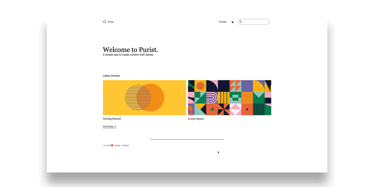
Purist – A Gatsby theme
A clean, full-featured theme with built-in search, dark mode, and social sharing – all for creating content with Gatsby.
Features
Why you should use Purist:
Search
Search is built in using
FlexSearch.js to find content
quickly and easily.
Dark mode
A toggable light and dark theme are available out of the box using the
prefers-color-scheme media query to determine the default theme.
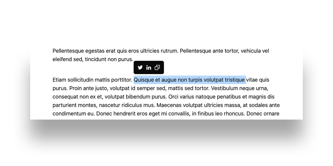
Social Sharing
You can select text within an article to easily copy or share directly with
Twitter and LinkedIn.
Getting Started
A guide on how to get started with Purist.
Installation
Using the gatsby-cli:
gatsby new my-site https://github.com/sebsojeda/gatsby-starter-purist
Using git:
git clone https://github.com/sebsojeda/gatsby-starter-purist my-site

cd my-site

yarn
Development & Build
Once the starter has been downloaded, you can begin development.
# Run localhost
yarn dev

# Production build
yarn build

# Clear all caches
yarn clean
Creating an article
To create an article, create a new folder in /content/articles/. You can name
it anything you'd like, but the folder name will determine the slug for the
page. Then you can add an index.mdx file for your content. Any media files for
your article can also go in this folder.
/content/articles/my-first-article/index.mdx
---
title: My first article
date: 2020-12-25
featuredImage: ./hero.jpg
draft: false
---

# Create your awesome MDX content here
Configuring site metadata
Add a site configuration to customize the theme to your liking.
/gatsby-config.js
module.exports = {
  siteMetadata: {
    name: 'Purist',
    defaultTitle: 'Purist: Creating content',
    titleTemplate: '%s • Purist: Creating content',
    description:
      'This is my description that will be used in the meta tags and important for search results',
    hero: {
      heading: 'Welcome to Purist.',
      subheading: 'A clean way to create content with Gatsby',
    },
    social: [
      {
        name: 'Twitter',
        url: 'https://twitter.com/sebsojeda',
      },
      {
        name: 'GitHub',
        url: 'https://github.com/sebsojeda',
      },
    ],
  },
  plugins: ['gatsby-theme-purist'],
};
Customization
Adding your logo
Your logo must be in SVG (vector) format in order to add it to the theme. This
is required because we will be making a React component containing your SVG
Logo.
Start by creating the component file at:
  gatsby-site
  └── src
    └── gatsby-theme-purity
      └── components
        └── Logo
          └── index.js
Once the file is created you can create your Logo component.
import React from 'react';

/**
 * Paste in your SVG logo and return it from this component.
 * Make sure you have a height set for your logo.
 * It is recommended to keep the height within 24-34px.
 * Make sure you set any 'fill' and 'stroke' attributes
 * to "currentColor" if you would like the hover effect.
 */
export default function Logo() {
  return (
    <svg viewBox="0 0 28 28" height="24px" fill="currentColor">
      <circle
        cx="14"
        cy="14"
        r="12"
        stroke="currentColor"
        stroke-width="2"
        fill="none"
      />
    </svg>
  );
}
Changing styles
Create a theme file and then you can override it with custom values.
/src/gatsby-theme-purity/theme/index.js
export default {
  fonts: {
    sans:
      'ui-sans-serif, system-ui, -apple-system, BlinkMacSystemFont, "Segoe UI", Roboto, "Helvetica Neue", Arial, "Noto Sans", sans-serif, "Apple Color Emoji", "Segoe UI Emoji", "Segoe UI Symbol", "Noto Color Emoji"',
    serif: 'ui-serif, Georgia, Cambria, "Times New Roman", Times, serif',
    monospace:
      'ui-monospace, SFMono-Regular, Menlo, Monaco, Consolas, "Liberation Mono", "Courier New", monospace',
  },
  modes: {
    light: {
      colors: {
        background: 'hsl(0deg, 0%, 100%)',
        text: 'hsl(222deg, 22%, 5%)',
        info: 'hsl(245deg, 100%, 60%)',
        infoBackground: 'hsl(210deg, 55%, 92%)',
        accent: 'hsl(245deg, 100%, 60%)',
        muted: '#73737d',
        hover: '#dbdbdb',
      },
      prism: {
        inlineCode: 'hsl(225deg, 12%, 40%)',
        background: 'hsl(225deg, 25%, 97%)',
        text: '#2a2a2a',
        highlight: 'hsl(225deg, 25%, 93%)',
        border: '#bf00b8',
        comment: '#467790',
        number: '#bf00b8',
        boolean: '#bf00b8',
        string: '#651fff',
        keyword: '#651fff',
        operator: '#651fff',
        property: '#da0079',
        tag: '#da0079',
        function: '#3d5afe',
        builtin: '#3d5afe',
        regex: '#3600d6',
        deleted: 'rgb(255, 85, 85)',
        attrName: '#aa00ff',
      },
    },
    dark: {
      colors: {
        background: 'hsl(210deg, 30%, 8%)',
        text: 'hsl(0deg, 0%, 100%)',
        info: 'hsl(230deg, 100%, 67%)',
        infoBackground: 'hsl(210deg, 38%, 15%)',
        accent: 'hsl(333deg, 100%, 52%)',
        muted: '#73737d',
        hover: '#1a1a1a',
      },
      prism: {
        inlineCode: 'hsl(210deg, 14%, 66%)',
        background: 'hsl(210deg, 30%, 12%)',
        text: '#fff',
        highlight: 'hsl(210deg, 30%, 18%)',
        border: '#ffd600',
        comment: '#6c8998',
        number: '#ffd600',
        boolean: '#ffd600',
        string: 'rgb(155, 109, 255)',
        keyword: 'rgb(155, 109, 255)',
        operator: 'rgb(155, 109, 255)',
        property: '#ff39a8',
        tag: '#ff39a8',
        function: 'rgb(0, 190, 255)',
        builtin: 'rgb(0, 190, 255)',
        regex: '#ffd700',
        deleted: '#ff5555',
        attrName: '#c653ff',
      },
    },
  },
};
Data Models
Article
| Key | Required | Type | Description |
|---|---|---|---|
| title | required | String | Used as the article title. |
| date | required | Date | YYYY-MM-DD format. |
| featuredImage | optional | File | The image to be featured on the article. |
| draft | required | Boolean | If draft is true, the article will not be rendered in production. |
Site Metadata
| Key | Required | Type | Description |
|---|---|---|---|
| name | required | String | The name to display in the navigation. |
| defaultTitle | required | String | Fallback text for the <title></title> tag. |
| titleTemplate | required | String | Template used for the <title></title> tag. |
| description | required | String | Used for the <meta name="description"></meta> tag. |
| hero.heading | required | String | Text displayed on the homepage hero. |
| hero.subHeading | optional | String | Subtext displayed on the homepage hero. |
| social | optional | Array | List of objects containing a name and a url to link in the footer. See a list of supported icons. |
Supported Icons
The following icons are supported, along with a default option as well.
const icons = {
  behance: (props) => <Behance {...props} />,
  codePen: (props) => <Codepen {...props} />,
  devTo: (props) => <DevTo {...props} />,
  discord: (props) => <Discord {...props} />,
  dribble: (props) => <Dribbble {...props} />,
  facebook: (props) => <Facebook {...props} />,
  flickr: (props) => <Flickr {...props} />,
  github: (props) => <Github {...props} />,
  instagram: (props) => <Instagram {...props} />,
  linkedin: (props) => <Linkedin {...props} />,
  medium: (props) => <Medium {...props} />,
  patreon: (props) => <Patreon {...props} />,
  paypal: (props) => <Paypal {...props} />,
  reddit: (props) => <Reddit {...props} />,
  snapchat: (props) => <Snapchat {...props} />,
  stackOverflow: (props) => <StackOverflow {...props} />,
  tumblr: (props) => <Tumblr {...props} />,
  twitch: (props) => <Twitch {...props} />,
  twitter: (props) => <Twitter {...props} />,
  unsplash: (props) => <Unsplash {...props} />,
  youtube: (props) => <Youtube {...props} />,
  default: (props) => <Globe {...props} />,
};


